The concept is about a Soviet informant Oleg Penkovsky who yearns for freedom and peace, betraying his country by providing information, successfully defusing the Cuban Missile Crisis, and leading and saving the powerless population. In the sequence, the white feathers symbolize the general public, while the red feathers symbolize Oleg Penkovsky, who is initially hidden in the crowd, but as camera advances he gradually separate from the crowd and becomes a obvious and independent presence floating into the air, just like a brave pioneer leading the public to the desired freedom. The final frame of an independent red feather seems to float into the air and also seems to float down, leaving space to let people reverie, the selection between serving the country, or freedom and life, his courage makes us rethink about justice.
THE COURIER
TITLE SEQUENCE REVEAL, STYLEFRAMES
ROLE:
Concepting, Storyboard, Photography, Typography
PROGRAM:
Photoshop, Lightroom


STYLEFRAMES


PROCESS

In the first few frames of the sequence I used Sulfuric acid paper/ vacuum plastic bag to cover the white feathers in order to get a sense of haziness. At the same time, the revealing of the red feather 's existence makes it appear and difficult to distinguish.


STORYBOARD


TYPOGRAPHY

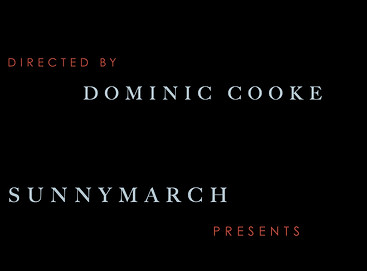
Big caslon is a traditional serif typeface, it has an old-style serif letter design, that produced letters with a relatively organic structure resembling handwriting with a pen, the carving style is exquisite, It also has generous proportions and it was cast with letter-spacing that was not too tight. The sophiscated type style in the sequence fits the historical background of the story - The Cold War, seems calm and elegant, as if the character of the story had written these words with a pen. Century gothic pro, as the secondary typeface, is a classic sans serif typeface that has contrast with big caslon, they fit well in the typography.


