

AMOEBA MUSIC REBRAND
BRAND IDENTITY SYSTEM, 2D ANIMATION
Amoeba Music is an American independent music store chain with locations in California, the brand brings a lot of joy to Californians from generation to generation. The goal of this rebranding project is to explore the potential characteristics and brand attributes based on its legendary history, to make the brand image stronger and deepen the public's perception, making it stand out from the record market.
The Rebranding of Amoeba Music is committed to demonstrating its uniqueness from the attributes of an inclusive market, diverse music, classic collection, passionate atmosphere, and iconic California image, this leads to our brand tagline: Old, but gold.
ROLE:
Identity Design, Rebranding, Montage Animation, Web Design
PROGRAM:
AfterEffect, Adobe Premier, InDesign, Photoshop, Adobe XD
RECOGNITION:
LOGO

LOGO CLEAR SPACE

APP LOCK-UP

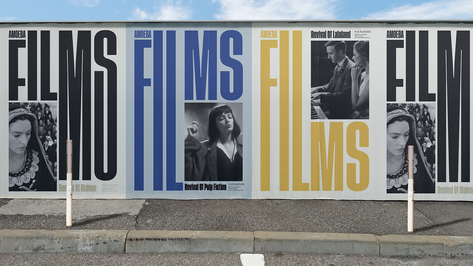
POSTERS


.jpg)

WEBSITE


MOBILE WEBSITE

MOBILE APP

BUSINESS CARD


ENVIRONMENT


MONTAGE SEQUENCE

BACKGROUND MUSIC:
Ain't Nuthin by TheBrewz
IMAGE FOOTAGE:
Unsplash.com
VIDEO FOOTAGE: